Leveraging the scorecard
This guide will show how to identify your riskiest and healthiest environments using the Scorecard.
Overview
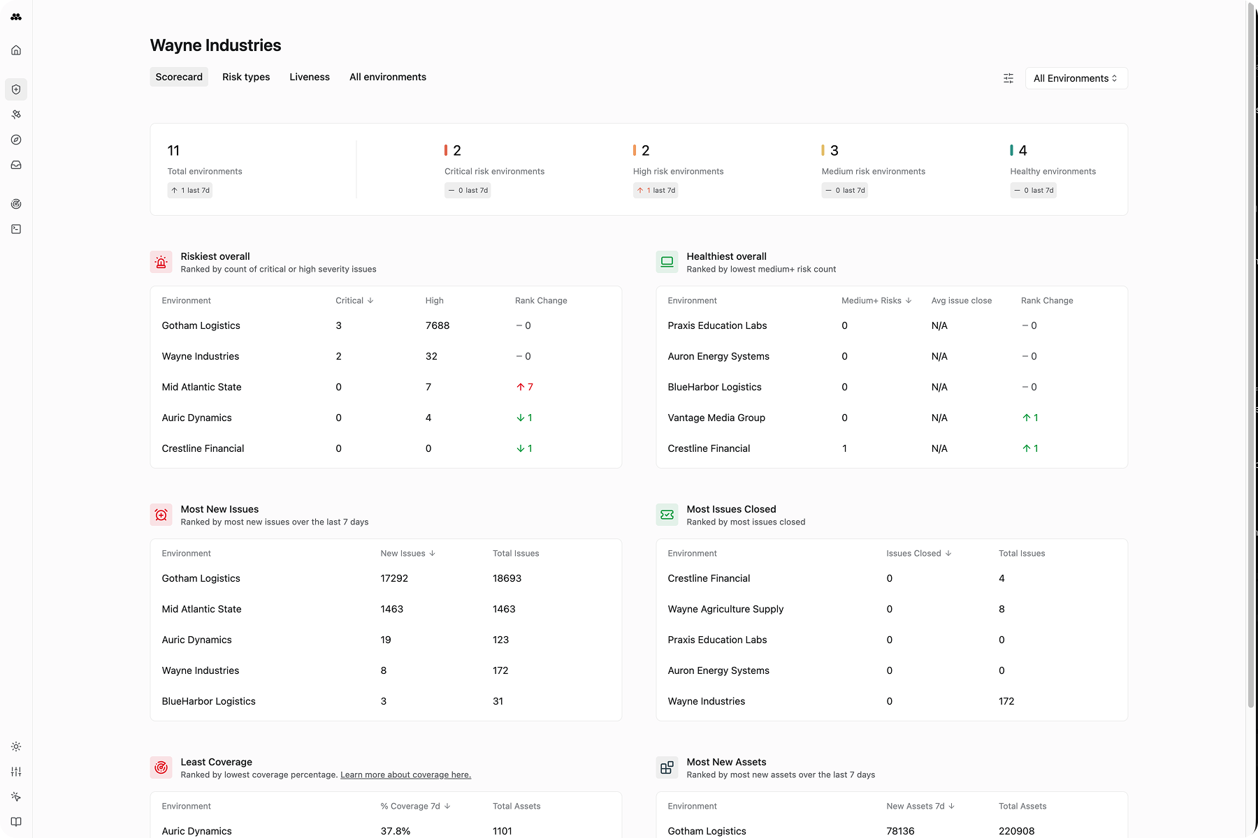
The Scorecard is part of Bastion’s cross-environment dashboard, where you can view and understand risk across multiple environments at high scale. The Scorecard gives you an at-a-glance understanding of which environments are performing best or worst on key health metrics. This page also shows how environments have changed over the last 7 days, so every metric is paired with a sense of whether it is trending in the right direction.
On each card, you can click on any line item to open the details of that environment. This allows you to investigate each metric further.
By default, cards on the Scorecard tab show the top 5 environments in each category. You can view the full ranking by hovering over the card and then clicking on the right-arrow which appears. This will take you to the All Environments tab sorted by the same metric so you can view the full ranking.
Riskiest Overall
This card shows you the environments within your organization which have the highest count of critical-severity or high-severity issues.
By clicking on the # and % icons, you can change the way this metric is calculated.
#shows you the environments with the highest count of critical or high-severity issues.%shows you the environments that have the most critical or high-severity issues based on how prevalent they are given the size of each environment. You can think of this as “per capita” risk, where the risk score is proportional to the count of assets in each environment.
Click on any line item to open the single-environment view to get a closer look at a specific environment.
Healthiest Overall
This card shows you your healthiest environments, computed using two different metrics.
By clicking on the clock icon or alert icon, you can switch between the metrics.
Clockshows you environments based on how quickly they resolve open critical-severity or high-severity issues. Environments with a faster average close time rank higher.Alertshows you environments based on how few medium, high, or critical-severity issues are present. Environments with fewer issues will rank higher.
Click on any line item to open the single-environment view to get a closer look at a specific environment.
Most new issues
This card shows you which environments have had the most new issues over the last week. This can shed light on which environments are seeing an uptick in high-severity or critical-severity risks. Click on any line item to investigate what the new issues in each environment are.
Most closed issues
This card shows you which environments have had the most issues closed over the last week. This can give you an idea of which environments are investing in the resolving open issues. Like the other cards, you can click on any item to investigate further.
Least coverage
Coverage is Method’s metric for determining how often something is monitored via a task run. This card shows which environments have assets which are known to exist but were not monitored over the last 7 days. More frequent monitoring ensures that issues are discovered sooner. Having assets that are discovered and then not monitored can indicate increased risk due to lower visibility.
Most new assets
This card shows which environments had the most new assets over the last week. Unlike the other cards on the Scorecard, this card is not green or red because it is not necessarily good or bad when there are many new assets discovered in an environment. However, it can be a sign worth investigating further to ensure that the discoveries are expected and secured.